

Alex DRocks just released a new tool that makes tracking Bittensor transactions way easier. On January 15, 2026, he announced TaoFlows, a web dashboard that monitors TAO token movements across all 128 subnets in real time.
The tool is live at taoflows.app, and it’s free to use. Taoflows is built for high-speed monitoring of $TAO activity, combining real-time block data with flow-based liquidity visualizations across all 128 Bittensor subnets. It also supports up to four simultaneous live price charts, allowing users to track subnet-level price action and capital movement from a single dashboard.
What TaoFlows Actually Does
Think of TaoFlows as a control panel for watching money move around the Bittensor network. Instead of checking multiple places to see what’s happening with different subnets, you get everything in one dashboard that updates live.
The main feature is real-time transaction tracking. You can see every buy and sell happening across the network as it happens. Each transaction shows the time, which subnet it’s on, how much TAO was traded, the price, and the wallet addresses involved.
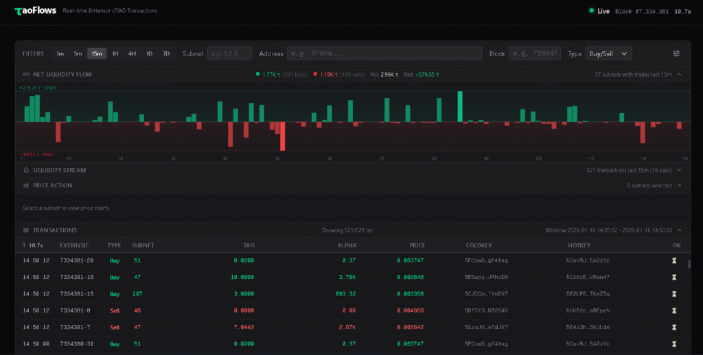
There are also liquidity flow charts. These visualizations show whether money is flowing into or out of different subnets over time. If a subnet is getting a lot of buying activity, you’ll see it. If people are selling, you’ll see that too. It’s basically a visual way to spot trends without staring at raw transaction data.
You can monitor up to four different subnets at once with live price charts. These are candlestick charts that update in real time, showing price movements over different time periods like one minute, five minutes, or fifteen minutes. This is useful if you’re actively trading subnet alpha tokens and want to watch multiple alphas simultaneously.
Why This Matters
Before TaoFlows, tracking Bittensor transactions meant using basic blockchain explorers that weren’t designed for trading. They’d show you transactions, but not in a way that helps you understand what’s actually happening in the dTao markets.
For traders, this changes things. You can now see patterns in how liquidity moves between subnets. You can spot when a subnet is getting unusual buying or selling activity. You can track your own trades and see them in context with what everyone else is doing.
For the broader Bittensor community, it makes the network more transparent. When you can see exactly how TAO and alpha tokens are moving around, it’s easier to understand which subnets are actually being used versus which ones are just sitting idle.
Alex specifically mentioned wanting to raise the standard for Bittensor platforms. By releasing this for free and making it fast, he’s essentially challenging other developers to build better tools. Competition like this tends to make the whole ecosystem improve.
The Technical Side
TaoFlows pulls data from a Bittensor archive node provided by the TAO Miners Union. An archive node is basically a complete record of everything that’s happened on the blockchain. This gives TaoFlows access to historical data plus real-time updates.
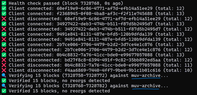
The dashboard shows live block data with the current block number and how long ago it was created. This helps you know exactly how fresh the information is. Bittensor creates new blocks regularly, and each block contains transactions that TaoFlows processes and displays.
The liquidity stream charts aggregate all the trading activity and show it visually. Instead of scrolling through thousands of individual transactions, you get a chart that summarizes whether net activity is buying or selling. The bars go up when there’s more buying, down when there’s more selling.
You can filter everything by specific subnets, wallet addresses, or block ranges. This is useful if you want to track a particular subnet’s activity or see what a specific wallet has been doing.
What Next
Alex mentioned the code is still in early stages and asked users to report any errors they find. This suggests TaoFlows will keep improving based on what people actually need.
Some potential additions that would make sense: alerts when certain conditions are met (like a subnet hitting a price threshold), historical data analysis tools, and maybe integration with trading platforms so you can execute trades directly from the dashboard.
The fact that it’s being actively developed by someone in the community rather than a big company means it’s more likely to get features that actual Bittensor users want rather than what some product manager thinks they need.
Getting Started
Using TaoFlows is straightforward. Go to taoflows.app, and you’ll see the dashboard immediately. No sign-up, no wallet connection required, just open it and start exploring.
The interface shows recent transactions by default. You can select which subnets you want to monitor from the dropdowns at the top. The price charts let you switch between different time intervals to zoom in or out on price action.
If you’re new to Bittensor, this is actually a good way to learn how the network works. You can watch real transactions happening and see how subnet tokens get traded against TAO. It makes the whole system less abstract.
For traders actively buying and selling subnet alphas, this becomes an essential tool. Having real-time visibility into liquidity flows helps you make better decisions about when to enter or exit positions.
The dashboard works on desktop browsers. Mobile might work, but the interface seems designed for larger screens where you can see multiple charts at once.
The Bigger Picture
TaoFlows is part of a trend in the Bittensor ecosystem, with community developers building tools that make the network more accessible.
When someone can track 128 subnets in real-time from one dashboard, it becomes realistic to actually trade these markets. Before tools like this, you’d need to be pretty technical just to figure out what was happening. Now, anyone can see liquidity flows visually.
As Bittensor grows and more subnets launch, tools like TaoFlows become even more valuable. You can’t manually track everything across a network this large. Dashboards that aggregate and visualize the data turn complexity into insight.
Be the first to comment